Design System

Use the existing design language to create a system that will enable cohesive, scalable, and efficient designs.
Timeline
May - Sept. 2024
Location
Miami and remote
Team/Partners
Senior Designers (3), Creative Director, Content Editor, CEO
Impact
Shipped designs to 60K+ users in 12 global markets
Snapshots from the Dorsia ios App, post-design system revamp.
Problem Statement:
Dorsia is a rapidly growing company, and with a design team of four (including me), the workload became hard to keep up with. Daily, the designers would receive dozens of creative requests from all company-wide departments, in addition to keeping up with their current project load and general responsibilities. With all of these varying kinds of requested work, we would have to have conversations about the design “treatment;” Text hierarchy, alignment, image treatment, layouts, etc? With that, we worked to create a streamlined design system to finally answer these questions constantly being asked.
Process:
The first and most vital aspect of the process was getting the creative team together in person, at a company organized Design Offsite. The three-day offsite consisted of brainstorming sessions designated for each topic we wanted to cover—The biggest focuses were on marketing and product, but there were various subcategories discussed (see Fig.1) We engaged in three design exercises framed by a question. After meeting together, we were aligned with a clear vision, and began working independently on creating assets, putting the new design system into practice. Many times, after working independently, we realized the new concept we created was flawed— it wasn’t intuitive, thoughtful enough, didn’t aesthetically work, among other issues— and we needed to make small iterations over time. By the end of the offsite, we had a cohesive idea of what the Dorsia design identity looks like, and it took a few weeks of widely scoped projects to hone it.
Result:
We created a system outlined in a 100 page deck, and enforced this system in our next app update, which consisted of a complete revamp of the homepage and navigation that served 60K+ users in 12 global markets.

(Fig.1): Prep canvas for the design offsite. It consists of an overview of current brand guides, business development assets, marketing campaigns, product launches, internal resources, and most importantly, the evolution of the Dorsia App. This was compiled by the Senior Designer, but is an important aspect of our process that I needed to include.


(Fig.2): During the offsite, the entire creative team reviewed customer data/feedback. Overall, users are satisfied with the experience, however there were several pain points that were addressed: Lack of relevant restaurant suggestions leading to less bookings, details not properly displayed during the booking experience causing customers to lose trust, etc. We worked to design solutions to address these problems.

Reservation Page V1
(Fig. 3): We expanded discussion to evaluating potential changes to all product offerings.

(Fig. 4): In order to enhance the user experience, we first went back to the nuts and bolts of it— the basic design system which includes visual style (color palette, typography, iconography, spacing and grids) as well as the UI components (Buttons, dropdowns, navigation bars, interaction states, etc.); All essential details ensuring an intuitive, seamless experience.
This process included going into our Figma page and simply organizing what is currently being used, and also proposing certain adjustments to the title size, spacing, hierarchy, labels, buttons, and eyebrow text. While seemingly minimal, these changes improved readability, consistent spacing, clarity, accessability, and scalability.
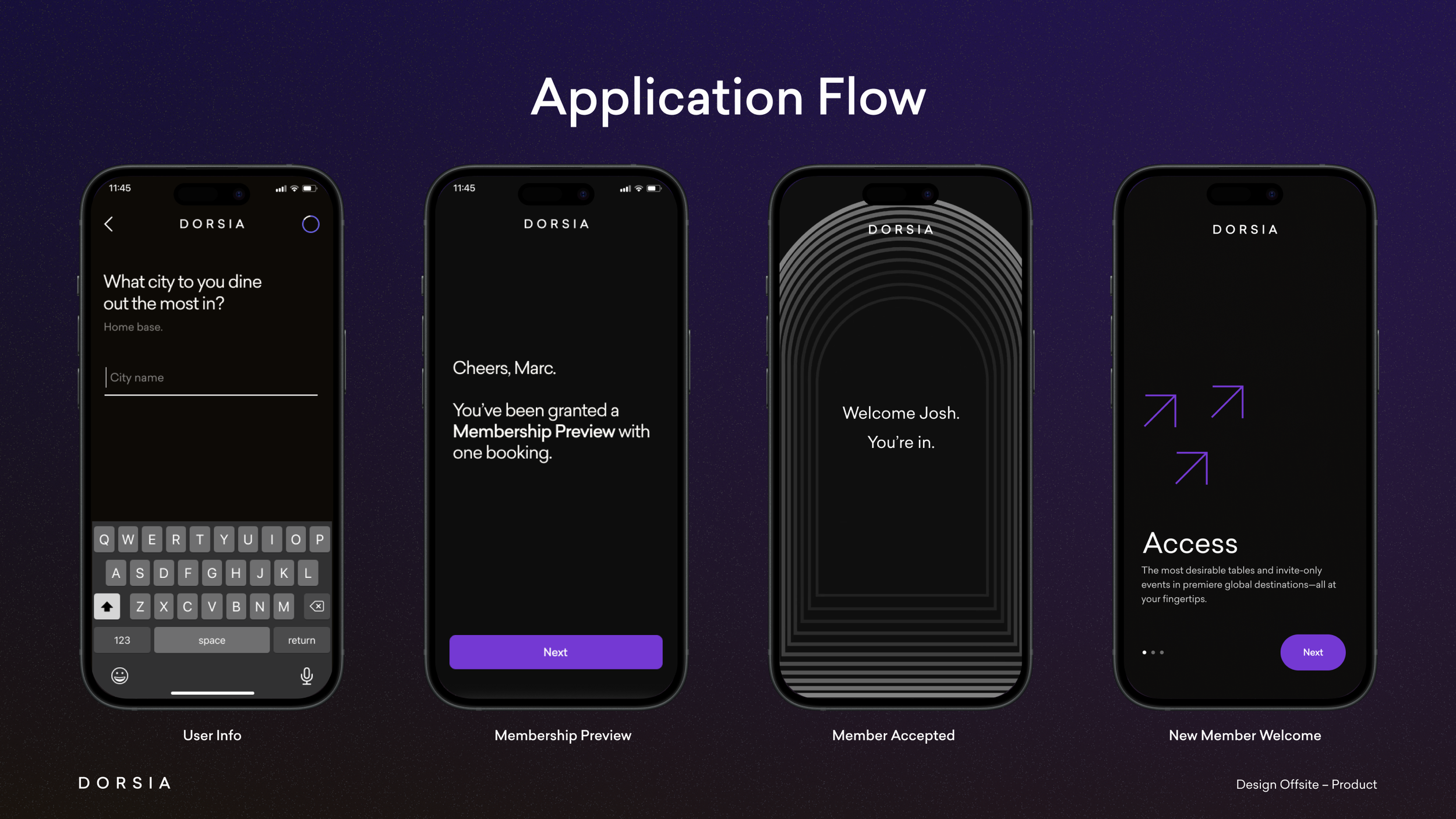
(Fig. 5): The changes to the design system were implemented throughout the app. Most importantly, making the onboarding experience as seamless and enjoyable as possible. While I can’t take credit for the design of this experience, the mere exposure to the process is invaluable. The design of the onboarding experience is crucial because, according to the first-member heuristic, users form lasting impressions of an app based on their initial interaction, which shapes their perception and likelihood of continued use. Just like John Ive said about spending extensive time and focus on Apple’s packaging design— “It’s the first time we get to see and use our product,” we applied the same thinking towards the design of the application flow.


Updated Reservation Page
Knowing that user’s experienced pain points in the later stages of the customer journey, which was tracking their live receipt, being able to access receipts so they can expense them, etc, we updated the reservation page to include all of their past reservations— making the ability to view details from their meal easier, also subliminally reminding them of their (hopefully) positive experiences from past reservations. Also, notice a difference in the design elements that were changed — background color, button, type, to feel more minimal. As Jony Ive said, “Good design is as little as possible.”


Navigation V1
Current Navigation
The content is intended solely for informational purposes and may not be reproduced, distributed, or used in any way without prior written permission from Dorsia and Koops LLC. All logos, design, copy, data, and other intellectual property are proprietary to Dorsia.
After reading that users felt there wasn’t enough of a selection of restaurants to choose from, we had two main options: Onboard more restaurants, and/or make the current options more prevalent and easily accessible. We chose to work with both solutions. The task of onboarding more restaurants was passed to another team, but once that happened, I was responsible for adding them all to the app and Dorsia.com—including choosing the hero image, inputing all the classifification data like the neighborhood, cuisine type, creating the vector white logos for them, etc. We also workshopped some changes to this navigation page that populate it with more relevant suggestions based on the user’s geographic location.

I always give credit where credit is due: For these series of app updates, my involvement was heavy in the brainstorming/low fidelity stages. I helped conceptualize these changes, sometimes even worked on creating my own mockups on Figma which were often well received and used for the final designs. However, after low fidelity, these designs were shipped to our senior Product Designers and Engineers where they were iterated, transformed into high fidelity, and developed.

(Fig. 6 - left. Fig 7 - right): Part of enforcing the design system was making sure it was applied to all products— including Dorsia.com. I was responsible for updating the website using Framer, with new markets and venue partners.

(Fig. 8): In additon to creating a basic design system that was used in-app and web, we created a set of guidelines for the rest of our digital content. We created categories of content, such as “holiday,” “editorial,” “press clippings,” “and most importantly, our “Tier A Venue Launches”-- as seen here in Fig.8. Imagine this framework and breakdown applied towards all of our digital content. For the first time, we have an ownable, consistent brand. My involvement in this was high. I worked with one senior designer on spearheading an overhaul of all digital content and we worked together tirelessly at designing the perfectly balanced templates that will serve our design team far after I leave.
(Fig. 9): This deck was a culmination of our discussions at the Design Offsite, dozens of workshop sessions, hundreds of templates, user interviews/consumer attitudes, and company-wide conversations. With a team of six-ish, we developed the Dorsia identity. Coining our own “Bento Box” design aesthetic, the Dorsia identity is something ownable and niche to our brand. Two years in the making, I jumped in and helped reach the finish mark and in ten weeks. My senior designer, Jenny, developed this Dorsia Style Guide, a 100 slide framework that outlines our ownable, niche, visual strategy, story (B2C and B2B narratives), brand voice, and how to apply this consistently across platforms and channels.
This deck was produced by Jenny Zhang.